To compete for traffic, companies use a variety of marketing methods, including advertising. This requires constant effort and investment. After getting the coveted click, marketers must take the user to a landing page that delivers conversion. But sometimes, it turns out that winning the battle for traffic increases the scale of the business and has no effect on its effectiveness. The NIX Solutions team agrees that customer conversion starts with the landing page on your website. The key to success will be a well-tuned ad campaign in which the landing page is completely relevant to your ad. But this is one of the requirements for improving conversion characteristics. Other useful tips we will describe in more detail.
Add Visual Content
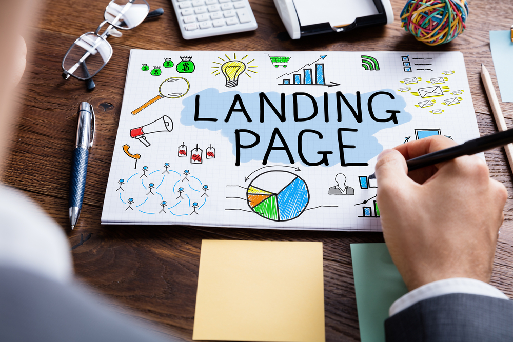
Good visual content that accurately communicates your message to users is highly valued in the content marketing world. It structures information by combining emotional and informational components. If we look at statistics, studies show that more than 60% of people learn visually. Users read only 28% of the text when they visit a website. Most of them would be more willing to read an article if it contained interesting, useful images.
Visual content is a pretty broad concept and includes a variety of formats. Videos, infographics, and articles with relevant images increase conversion rates by 86%. Visual content improves site behavioral factors and also:
- captures attention quickly;
- interacts with the reader;
- attractively shows complex terms.
In addition, its simplicity is enticing for any topic. It generates traffic by getting users to share information with friends. By supplementing the site with high-quality visual content, you will move to a new level of successful marketing.
Keep It Simple
Minimalism is the best style for a landing page. Place only the necessary elements on one page. You don’t want to overload a potential client with unnecessary information and make him wander through confusing mazes. Otherwise, the user will quickly leave your site, increase the bounce rate and make a high conversion rate your pipe dream. Use only necessary graphic elements, let the design look clean. Excessive images should not distract site visitors from the main purpose.
Keep navigation to a minimum or none at all. The more navigation options on your landing page, the more likely it is to be used. No navigation links are necessary. As the initial element of the sales funnel, the landing page should only point potential customers in one direction. If necessary, you can provide links related to the product itself. To do this, use modal windows that will show the necessary information without interrupting the conversion funnel.
Use Powerful Call to Action
Your call to action should be visible. Make it big and place it in an advantageous location. To focus attention, contrasting colors will work well. But the heading doesn’t have to be red, which makes many people unnecessarily anxious. There has to be a measure to everything. Calm colors, too, contrast well with each other. In addition, do not greatly exaggerate the value of your product/service because it can have the opposite effect.
Use the button correctly. A more neutral phrase will have a better effect. That’s why the “Submit” button is worse than “Get a free trial” or “Talk to an expert.” Perhaps you should avoid the forced implication of “Download now” or “Buy now” and divide the buying process into 2-3 steps. The client will be able to study the necessary information before making a final decision and will appreciate your offer. The button should be visible, understandable, and fit well with the site design.
Explain Pains and Pleasures
Act on the principle – you have a problem, we have a solution. If you get into the client’s pain, and he agrees with you, you are guaranteed sales. You must explain to the person: what he will gain by making a purchase and what he will lose if he doesn’t buy. But don’t present the pain or pleasure without explaining why your product is the solution. Try to show the functional and emotional side of the product.
Don’t make loud claims if you can’t back them up with real facts. They, like fake reviews, can play tricks on you. Customers will stop trusting you. People sense falsity and insincerity. But social media and recommendations from trusted sources play a big role in buying decisions. Use specific reviews from real people. A large fan base will help you gain new customers.
A/B Test
Do market research to compare several options and choose the most effective one. Experiment with different layouts, calls to action, form lengths, and content types. Try to identify the most converting headline, button type, color, and other elements on the site, from the different options. But A/B testing should be done regularly. Collect the data and think about new variables for testing.
Test gradually, don’t come up with a lot of options with different sizes and colors of buttons. It’s better to break the tests into several stages and start by testing large changes. Test very different versions and gradually make changes. Test the one that shows the best result. Prioritize hypotheses and start with the most important ones.
Summary
NIX Solutions specialists believe that landing page design and content are equally important. But most importantly, you should clearly understand what kind of action you expect a visitor to take. Create the most comfortable conditions for the user to take the action you want, and then you’ll have a converting landing page.