It’s not enough to launch an online store and promote it in search engines attracting potential customers. The main task is to convert as many visitors as possible into buyers, and this is the most difficult to deal with, claims CRN. NIX Solutions‘ experts advise online retailers to take into account the psychological characteristics of the modern mass buyer, adjusting the structure and design of the online store for them.
In the era of the wide use of the Internet, much more information is falling on each of us every minute than we can understand and comprehend. A number of researchers even argue that the average attention span of a typical representative of Western civilization decreased from 12 seconds in 2000 to 8 seconds in 2016, whereas for an ordinary aquarium goldfish the same figure is as much as 9 seconds. It is clear that we are talking here about a very absent-minded attention to information that does not have much value for our contemporaries, and if they concentrate willfully, they will not leave the slightest chance to the goldfish.
But the matter of fact is that the vast majority of consumers today do not perceive advertising information as relevant – a big “thank you” for the annoying marketing pressure in the classic media and online. A 2017’s comScore study suggests, for example. that millennials do not organically perceive advertising messages lasting more than 5-6 seconds. And 30-second commercials, which are usual for broadcast TV, simply infuriate them, often having the opposite effect: the rejection of a brand that is perceived as too annoying, instead of arousing interest in it.
Generations Y and Z, who grew up in front of computers and/or with smartphones in their hands, are generally much less likely to rely on unsubstantiated marketing when choosing this or that product: 84% of millennials do not believe in traditional advertising at all. The new mass consumer is inclined to independently conduct marketing research, albeit unprofessional and short-lived – fortunately, search engines and online price aggregators provide them with all the opportunities for this.
Google’s online marketing experts divide today’s online store visitors into three main categories: curious, demanding, and impatient. The first ones carry out preliminary surveys in the most thorough manner, dig up mountains of information, actively consult in specialized forums, in order to make the only right purchase, which they will definitely not regret later. The second group seeks out among the mass of available options one that would meet their internal (even if not clearly formulated for themselves) expectations literally at first glance. Finally, others simply seek to buy a more or less suitable product with minimal time and effort – and moreover, it is advisable not to miscalculate the price and quality.
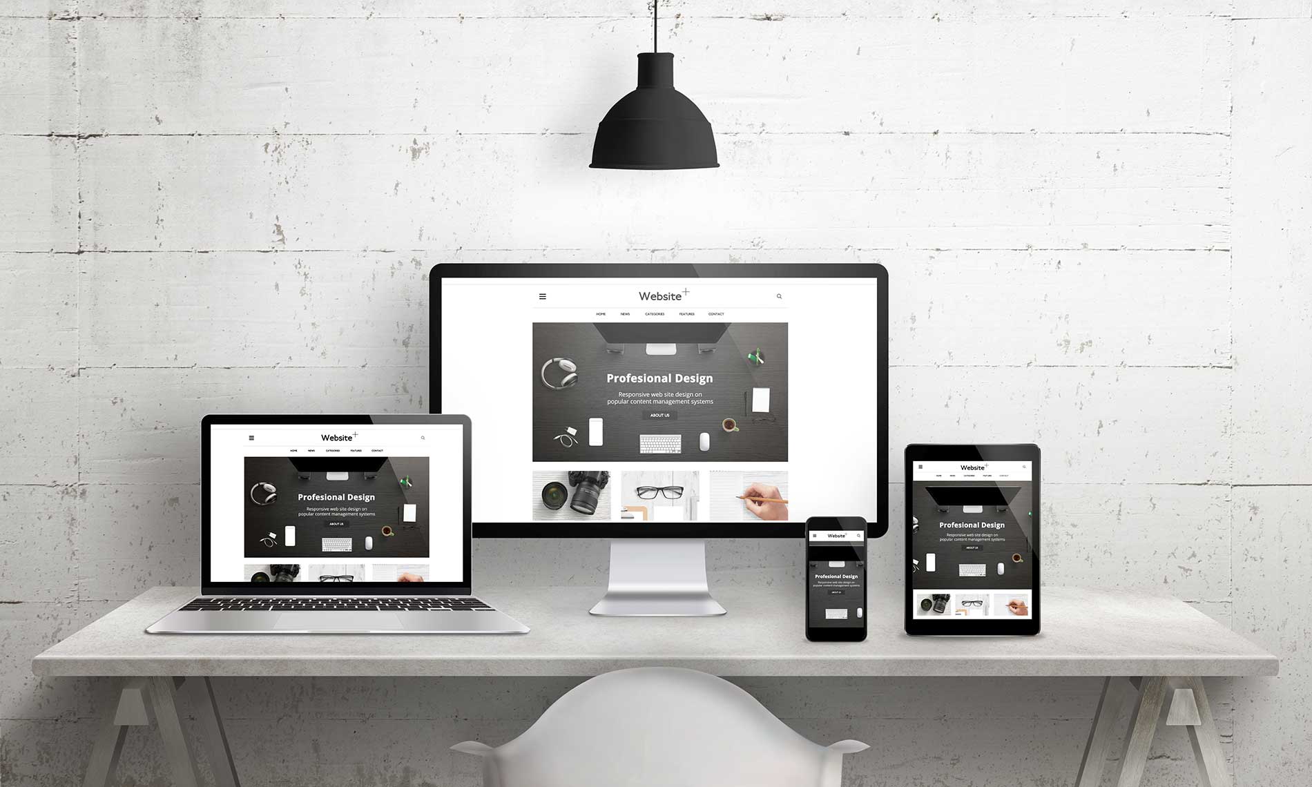
Requests and behavior patterns of inquisitive, demanding and impatient buyers must be taken into account by each player in the e-commerce market. Oganes Barsegyan, head of Digital Beverly Marketing Solutions, advises to start with what is immediately in front of the eyes and fingers of every visitor to an online store — with its design. You can make the site and the content of its sections more or less attractive for each of these categories of customers by changing its appearance – depending on which one is considered by the retailer as the most preferable.
The most important priorities in assessing existing web design or during the development of a new expert are as follows:
- Simple and clear navigation. For an online store’s app this means in particular that the search field should be immediately noticeable and easily accessible from any page of the site, whether it is an individual product or an already filled basket at the stage of order confirmation. The categorical list of products presented on the website should not be overwhelming in its scope: it is desirable to have no more than five to seven sections at each nesting level. At the same time, those categories of goods that are currently being promoted should be visually highlighted to attract the attention of impatient customers. The excerpts of even the most inquisitive visitors should not be overestimated, the expert recalls: no one has canceled the rule of “three clicks”, which states that if a customer doesn’t find a suitable product in three clicks on the links within the store, they will close the tab in the browser with a light heart and try their luck on another site.
- High page loading speed. Hosted on a slow low-cost hosting and non-optimized business website has the right to exist; An online store, even focused solely on inquisitive visitors, is by no means. According to the 2019 Page Speed Report, 22% of mobile users confirmed that they immediately left the loading pages for too long, and 14% said that the low speed of the online store directly encouraged them to make a final purchase (even at the same price and with the same terms of delivery) on a competing site. In addition, page loading speed is an important SEO factor and directly affects the position of the site in the search engine results list for relevant queries.
- User friendly layout. Bright red text on a pink backing? An artsy font that makes fluent reading difficult? Christmas Eve flash snowflakes that slow down page display on even the most powerful desktop PCs? These and similar design delights are the surest way to reduce online store traffic. UX experts have long noticed: shoppers, even the most inquisitive, do not read text on the web pages of online stores; they quickly glance at it in search of important words for themselves. And if they don’t immediately find them, they are very likely to go to the next e-commerce site in the search results list. Most often, the front page of an online store is viewed according to the F-scheme: first, they gaze intently at the headlines, and then, going down below, they snatch ever shorter fragments of text from the left edge of the screen in search of those most important words. Organized according to the F-scheme, the web page with the interruption of text blocks with catchy informatively saturated pictures has every chance to attract both inquisitive and impatient visitors.
- Strong and clear call to action. CTA button is the main lead generation tool; prompting a site visitor to subscribe to the newsletter, download a demo version of the software product or otherwise demonstrate their interest in further communications. It is necessary to approach the choice of a stimulating message, the location and even the color of the CTA with special care, knowing exactly which category of site visitors it should attract.
In any case, simplicity and clarity should be the main design principles for any e-commerce project. The sooner the visitor of the online store disappears from the feeling of novelty from interacting with the navigation elements and landing pages of the site, the sooner they will begin to actually make purchases. Online retail is not an art exhibition; increasing sales and increasing LTV is much more important than the original appearance. Experts advise to express themselves in terms of design in the “About the Company” section: only those who will certainly not be scared away by its most pretentious appearance will definitely look at this page of the site.