Reddit recently revealed a substantial brand update, marking a pivotal shift in its identity. The update includes a three-dimensional reinterpretation of its iconic SNOO emblem and the introduction of Reddit Display, a new corporate font. These changes signify a strategic move to position Reddit as the core of the Internet, departing from its prior status as a mere “face.”
Key Elements of the Update
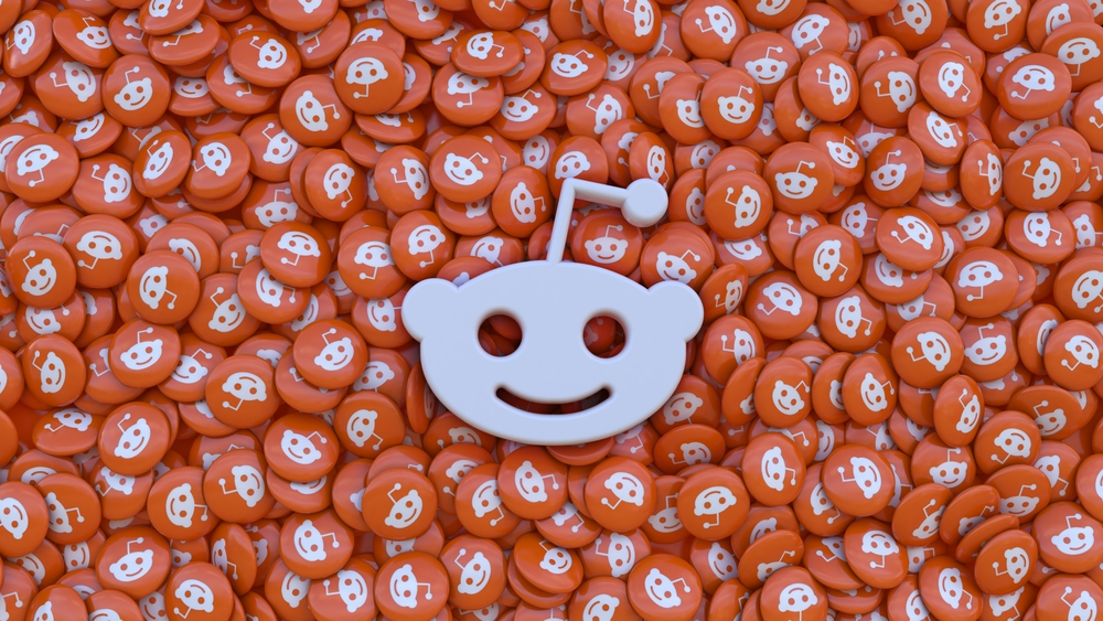
The focal point of this overhaul is the transformation of the Snoo emblem into a three-dimensional representation, signaling a fresh design trajectory for the company. Accompanying this visual evolution is the introduction of Reddit Display, a font tailored for striking and expressive headlines. Additionally, Reddit Sans, a font aimed at widespread usage, has been made available as open-source code.
Evolution of the Brand Palette
The brand’s color palette has also seen an update with the inclusion of new hues like Limegreen and Juniperblue alongside the traditional Orange. This infusion of new colors aims to present Reddit with a rejuvenated and more identifiable image.
Reddit’s Future and Community Response
Amidst discussions of a potential IPO in 2024, Reddit has been actively expanding its global audience, with 20% of its advertising revenues coming from international advertisers. However, the community response to these updates has been mixed. While some users feel nostalgic for Reddit’s previous design, others are skeptical about the innovations, emphasizing the importance of functionality over external changes.
Significance of the Update
These changes hold significance not only in terms of visual identity but also in Reddit’s positioning within the internet landscape, notes NIX Solutions. The success of these innovations hinges on their alignment with user expectations and needs. Reddit’s interaction with the community and incorporation of their feedback will be pivotal in its continued growth and consolidation within the digital sphere.