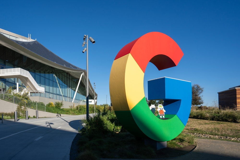
Google’s previous branding update took place nearly a decade ago, on September 1, 2015. At that time, the company introduced the Product Sans typeface, replacing its previous serif logo. This change also affected the icon—transforming the small white “g” on a blue background into a multicolored capital “G”. That design has represented Google across its products and services ever since.
Now, the company has introduced a new version of the familiar “G” icon. Instead of solid color segments, the updated icon features a smooth rainbow gradient. The transitions are subtle, moving from red to yellow, yellow to green, and green to blue. According to Google, this design feels more modern, vibrant, and colorful.
The new gradient icon aligns more closely with the Gemini branding—a visual style already familiar to users who have engaged with the AI mode in Search. In that context, a similarly styled gradient icon has been used as a shortcut for invoking Gemini functionality.
Gradual Rollout and Visual Consistency
Currently, the refreshed icon appears on the Google Search app for iOS. While the change is relatively minor, many users may not notice it immediately, especially since it retains the overall structure and shape of the previous design. However, the smoother color transitions give it a slightly softer and more polished appearance.
At the moment, Google does not appear to be changing its main six-letter logo, adds NIX Solutions. The updated gradient seems to be reserved for app icons and potentially other interface elements. Yet we’ll keep you updated as more integrations become available or if Google decides to extend the refresh to other parts of its visual identity.
As with many visual updates from Google, this change may be part of a broader strategy to unify branding across platforms and highlight its growing focus on AI-driven features. The updated icon serves as a quiet but deliberate visual cue that the company’s identity is evolving—just not all at once.